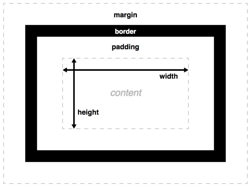
Block Elements: take up the full width of the page and start on a new line.
<div>, <p>, <h1>, <section>
Inline Elements: take up as much space as necessary and do not start on a new line.
<span>, <a>, <strong>, <em>
CSS Selectors
Selectors are used to choose which elements we want to style.
Type Selector: targets all elements of a certain type.
p{color:blue;}
Class Selector: targets elements with a specific class.
.highlight{background-color:yellow;}
ID Selector: targets an element with a specific ID.
#header{font-size:24px;}
Descendant Selector: targets elements inside another element.
div p{color:green;}
Pseudo-Classes & Pseudo-Elements
Pseudo-classes allow us to style elements based on their state.
For example, we can change how a button looks when a user hovers over it.
button:hover{background-color:lightblue;}
Pseudo-elements allow us to style specific parts of an element
For example, we can change the first letter of a paragraph.
p::first-letter{font-size:2em;color:red;}
Conflict Resolution
Sometimes, multiple rules apply to the same element, so CSS needs to determine which rule should take effect. This is called: Specificity.
Priority order:
Inline styles.
ID selectors.
Class selectors.
Element selectors.
If specificity is the same, the last rule in the CSS file wins.
p {color:blue;}#special {color:red}
In this example, if we apply both these rules to the same paragraph, the text will be red because the ID selector has higher specificity.
Practical Part
Step 1 : Avoid making content too wide
In this part we are going to edit the appearence of our website. For that purpose, we will be editing the style.css file in our repository.
First, let’s stop the content from getting so wide, by applying a max-width to <body>. We will specify that max-width in em, rem, or ch units, so that it scales with the font size. Experiment with the browser dev tools to find a good value for max-width. I used 100ch:
Now let’s center that content. We can do that by using the special value auto for the left and right margin. We can set both of these to the same value by using the margin-inline shorthand property.
But try resizing your window to be smaller than that max-width we set.
Our content is now touching the edges of the viewport, which makes it hard to read. One way to fix that is to add some padding to the content.
TIP
What would be another way to solve it? We can specify a lower bound for our margin by using the max() function, but we need to specify the margin explicitly, not using the auto keyword:
margin-inline: max(1em,(100% - 100ch) / 2);
Step 2: Styling the navigation bar
Ignoring lists
If you have used a <ul> element within your <nav>, you can tell the browser to ignore that <ul> and its <li> children for stylng by applying display: contents to them both, which prevents them from having any styling of their own.
nav ul,nav il {display:contents;}
Using Flexbox
First, let’s add a class="current" attribute to the a element of our current page, which will allow us to style it differently.
Let’s apply display: flex to the <nav> to enable Flexible box layout (Flexbox).
You will not notice any immediate difference, but we can now use Flexbox to control the layout of the children of <nav>. Apply flex: 1 to each of the <a> elements to make them take up the same amount of space.
nav {display:flex;}nav a {flex:1;}
Adding some style
Remove the underline from the links by setting text-decoration: none.
Remove the gory default link color by setting color: inherit to make links use the same text color as their parent element.
Center the text in its box by setting text-align: center.
Let’s give each link some spacing by adding some padding (for example 0.5em).
Apply some margin-bottom to the whole <nav> to separate it from the content below.
nav a {flex:1;text-decoration:none;color:inherit;text-align:center;padding:0.5em;}
Adding some style
Apply a bottom border to the <nav> to visually separate it from the content. Give it a border-bottom-width of 1px, a border-bottom-style of solid, and a border-bottom-color of oklch(80% 3% 200) (some gray).
CSS Variables
The var() function is used to insert the value of a CSS variable. You can create variables with local or global scope, change the variables with JavaScript, and change the variables based on media queries.
A good way to use CSS variables is when it comes to the colors of your design. Instead of copy and paste the same colors over and over again, you can place them in variables.
To create a variable with global scope, declare it inside the :root selector. And to create a variable with local scope, declare it inside the selector that is going to use it.
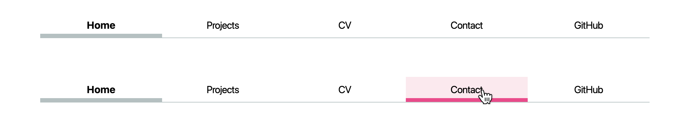
Let’s style the current page link. Give it a thick bottom border (for example width of 0.4em), and either the same gray as the navigation bar border, or a lighter version. To counter the increase in height that the border adds, apply a reduced padding-bottom to that link.
Exercise for you: Accent color and hover styles
Define an accent color for your website, and store it in an --color-accent custom property (for example oklch(65% 50% 0)). Let’s use this accent color to style hovered navigation links (a:hover).
What styles would you have to add or modify to get something like this:
Solutions
nav a.current {border-bottom-width:0.4em;border-bottom-style:solid;border-bottom-color:oklch(80%3%200);padding-bottom:0.1em;font-weight:bold;}
nav a:hover {border-bottom-width:0.4em;border-bottom-style:solid;border-bottom-color:var(--color-accent);padding-bottom:0.1em;background-color:oklch(from var(--color-accent)95%5%h);}
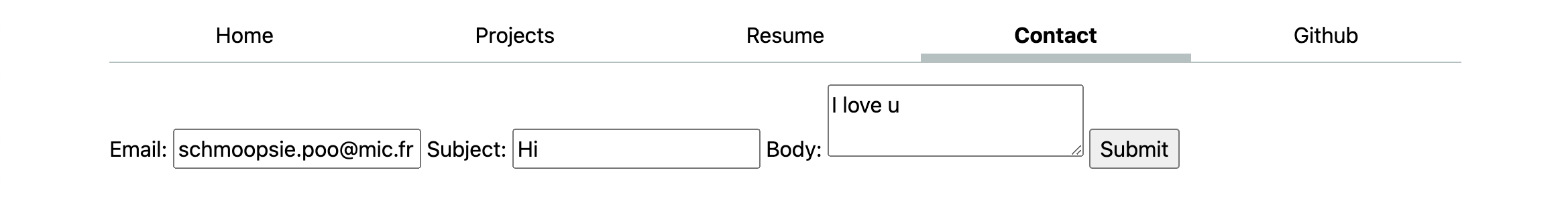
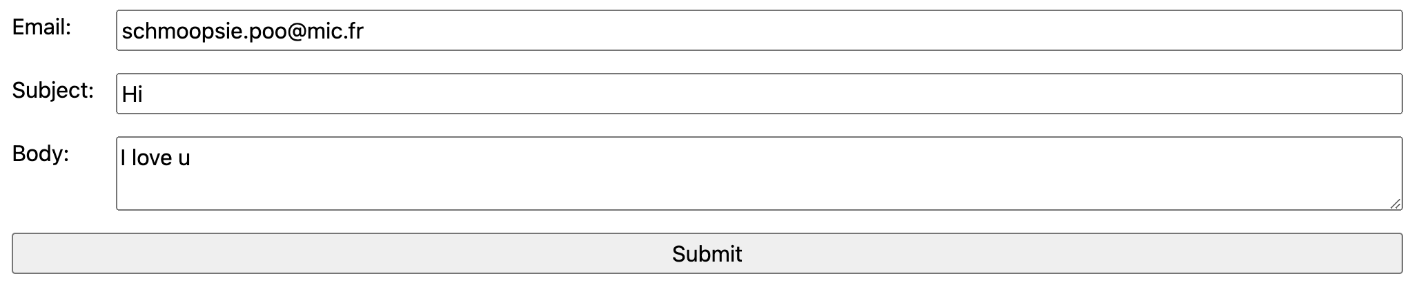
Step 3: Contact form layout
Integrate typography
Key elements of the from (the form controls<input>, <textarea>, <button>) have different sources. With the developer tool of inspection. All we need to make these use the same font as the rest of the page is font: inherit:
input,textarea,button {font:inherit;}
Top-down layout
Apply display: block to the form controls and labels to make them behave like block elements, i.e. insert line breaks before and after
Apply width: 100% to the form controls to make them take up the whole width of their container (in other elements display: block does this too, but form controls are special)
Apply box-sizing: border-box to the form controls to make their width of 100% include their padding and border
Apply margin-block to the labels to add spacing before and after them
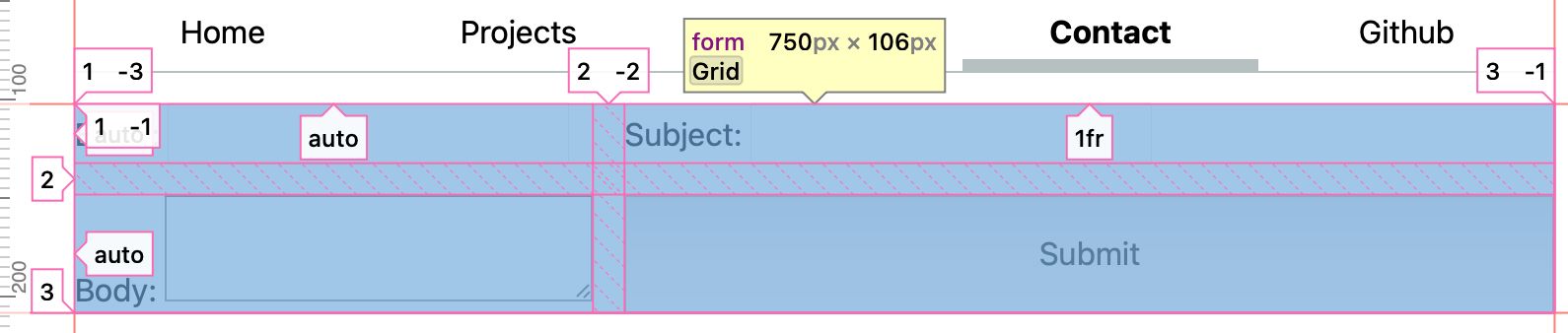
There is a better way to do something similar. CSS Grid: the crème de la crème of CSS layout methods. It may take some time to fully grok, but it is well worth it.
The core idea of CSS Grid is that we define a grid container (the element with display:grid), and then place its children in the grid (or descendants, through subgrid or display: contents).
Let’s remove the CSS you applied in the previous step, since we will not need it.
Starts by applying display: grid to the form. Note that you immediately see a change in the layout. We only need to define the actual constraints, and the browser will take care of the rest.
We need to define the columns, via grid-template-columns: auto 1fr.
auto means that the column will be as wide as its content, and
1fr means that the column will take up the remaining space (similar to flex: 1).
Depending on how you organized the labels and inputs in your form, we will need to separate the texts from the inputs. For this, we will make the labels grid containers themselves (display: grid), but their grid is a subset of the form grid (grid-template-columns: subgrid).
The last piece of the puzzle, is that we need to make the labels (and the submit button) to span a whole row. We can use that by grid-column: 1 / -1; which means that the element will start at the first column and end at the last (-1) column.
At this point, your form should look about right. The last remaining touch is to add gap: 1em; to the form to add some spacing between the form controls.
form {display:grid;grid-template-columns:auto1fr;gap:1em;}form label {display:grid;grid-template-columns:subgrid;}#button, label{grid-column:1 / -1;}
Step 4: Style your projects page
We will use Emmet to generate some dummy content. Copy the following abbreviation:
Paste it in your projects/index.html file under the <h1> element, and expand it with Emmet (delete and re-add the last character, then hit Tab).
It’s generally a good practice to restrict images from getting too wide by applying max-width: 100% to them. You don’t need to only apply this on images within ‘.projects’, you can apply it to all images.
Applying a responsive grid
First, apply display: grid to .projects to make it a grid container.
Then, use repeat(auto-fill, minmax(15em, 1fr)) for grid-template-columns to make the grid have as many columns as can fit in the container, each with a minimum width of 15em and a maximum width of 1fr (i.e. the remaining space).
Note that we don’t have a clear information hierarchy. The default <h1> size is very close to the default <h2> size, violating the design principle of contrast. Make it significantly larger (e.g. 400% the body text). This is not specific to the projects page, but it’s the only one that currently has <h2> elements.
While we’re at it we can also add some good defaults for all headings (h1, h2, h3, h4, h5, h6), by applying line-height: 1.1 (we typically want their leading to be smaller than body text) and text-wrap: balance to prevent uneven lines.
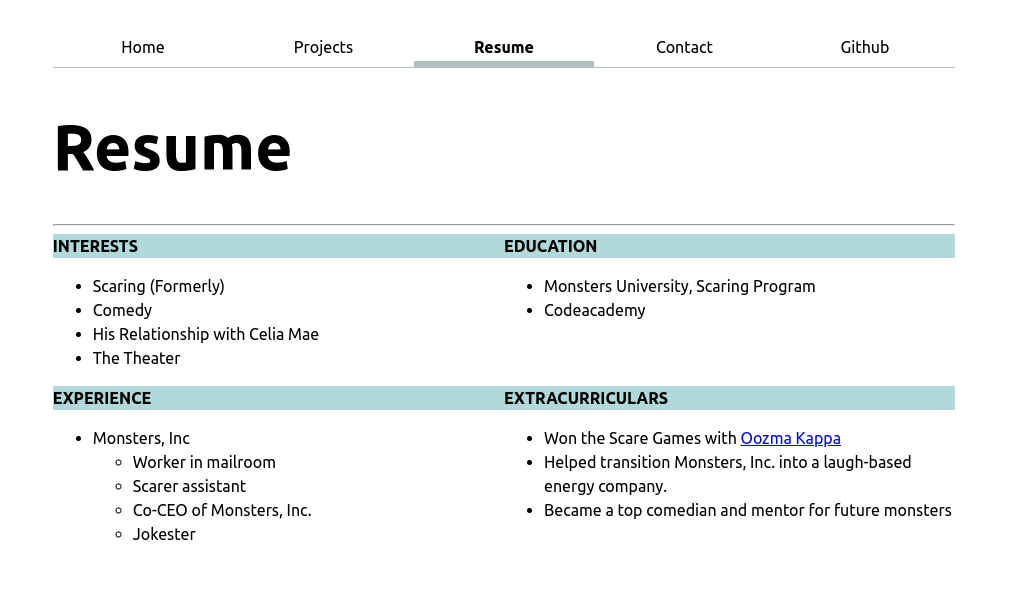
Now it’s your turn: Style your CV
You got your feet wet with CSS, experiment with it in a more freeform way by styling your CV/resume page.